


One the most frequently asked questions I get is a form of, “what color paint should I choose?” or “how do I pick the right color paint for my room?” So, today I’m going to give you all my tips on how to pick the “right” paint color for your spaces.
Pick a feeling not a paint color.
Before you pick a specific paint color, decide on the feeling you want for the space. Do you want to feel cozy and relaxed or energized and joyful? A feeling can really help give you some context of what direction you want take the room. When you know the feeling you’re trying to create, you’ll feel more confident in picking a paint color you like versus a popular color you see online.
Wait to pick your paint color.
Often people want to start with picking their paint color for the room, and in a way you want to know the direction you’re headed into, but don’t pick the final destination until you’ve made other design decisions first. If you pick paint color too early, especially if it’s a neutral, you can box yourself into finding pieces that work with the paint color. When instead if you knew you wanted to likely do a light neutral color walls, start by picking key furniture pieces for the space. Let’s use a living room for example, pick your rug and sofa first, then venture into paint color options. Paint can be the unifying element to bring all your design decisions together. Pick the color too early and you might have a hard time finding a rug or sofa that will match.
Pick the color that brings all your design choices together.
Paint is the link between all your design decisions. It’s a key player in making the space feel cohesive. Here’s a quick run down of how I’d pick a neutral color vs bolder color:
Neutral paint color:
I think neutral colors can be selected at nearly the end of your decorating process. Let’s use a living room as an example. You know you want your living room to feel light, but cozy. I would start by selecting the either a sofa or rug first. Maybe you have a space that can only fit a specific size sofa that’s not the standard size of about 72 to 84 inches long. You need something smaller than that, so I’d recommend starting your design process with your biggest design obstacle: sofa you like in the size you need within your budget and timeframe. You might find you are only able to find cream, tan or gray sofas at the size and price point. Maybe you initially thought in your design you’d get a green sofa from your inspiration photos, but in reality that’s not in your budget or timeframe. You’ll need to pivot your room design slightly now knowing your option for a sofa is a neutral. If you’d picked a cream wall color to go with a green sofa already you’d have to work backwards to find a sofa color that works with the wall color you already selected. This can be much hard task and can leave people feeling like they can’t figure it out and just give up. Instead, work through your key furniture and elements in a room first by sourcing some options that fit your space and budget. Then, you can comb through a smaller set of options and make a final selection. After those are picked, then look for that paint color that ties all your design decisions together.
Bold paint color:
Let’s say you want to go more saturated and bold with your walls in the space. I’m going to use a bedroom for this example. I’d start off by knowing what base color I want. Do you want muted green walls or bold burgundy color? You don’t need to pick a specific paint color put grab a few inspiration photos that have a color you like. Then, repeat the process I mentioned in the neutral paint color above. Source the piece that has the most constraints for the space first. Maybe it’s a rug that’s not your standard size in this option or a budget-friendly upholstered bed frame. Find a few options (about 3 to 5) for the key pieces within your constraints. Make a decision from your small set of selections. Then, you can pick that rich burgundy color you’re after that unifies the pieces together (but not until you do the other steps below!).
Swatch your top picks.
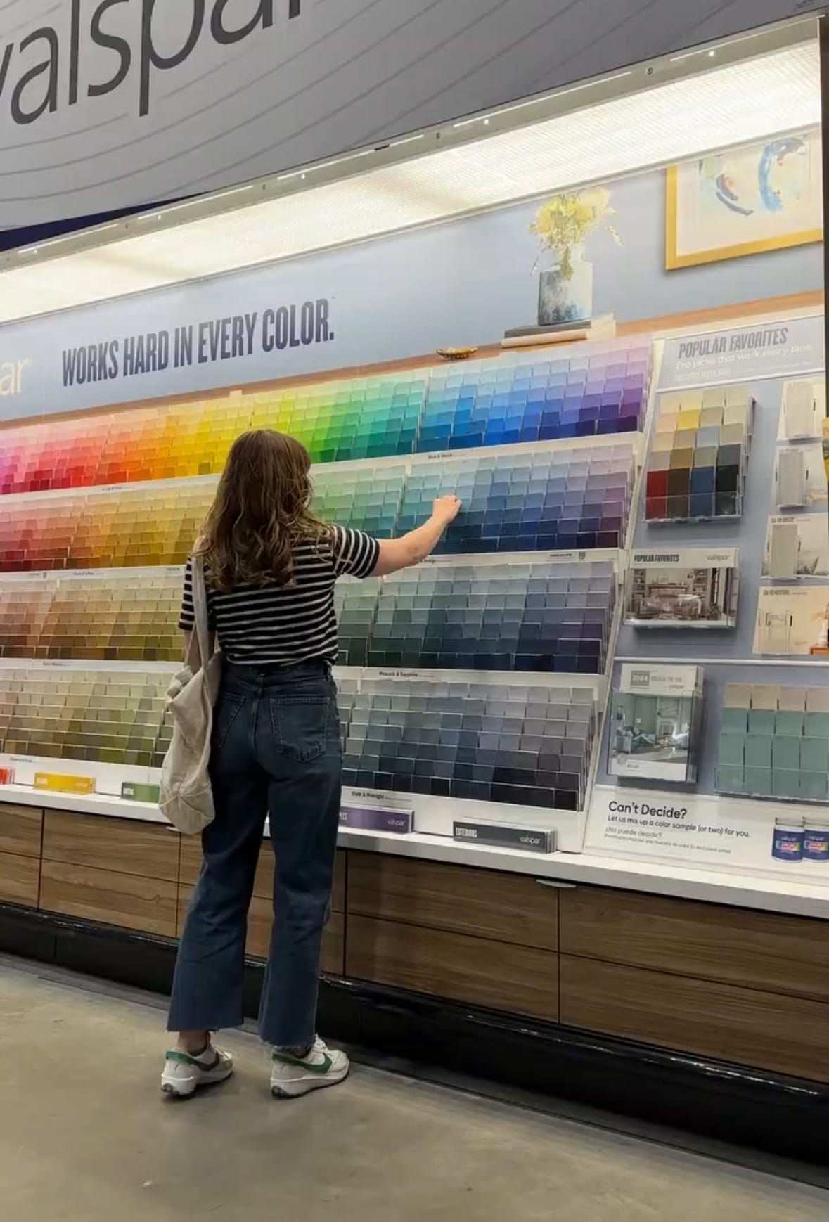
Okay, you have a feeling you want to create and direction of where you’d like go with the paint colors. You’ve decided on key elements like a rug, sofa, or bedspread. Now it’s time to look at specific paint colors. I can’t emphasis this enough, but make sure to swatch the colors in your actual room on 3 to 4 different walls. Colors look drastically different from the paint store swatch to the actual room. Swatch the colors big enough (about the size of a piece of paper) with at least 2 coats of paint. This will give you a true look at the color. Swatching multiple walls will show you how the location in the room can change the color. I did just this in our laundry room remodel. I swatched so many colors on all 4 walls and I couldn’t believe how differently the beige colors looked on the different walls. There was one color I really loved, but only on one wall, so obviously that wasn’t going to work.
Observe the colors over a 24 hour period.
Colors can look different on different walls throughout the day. Make sure you check in your swatches in the morning, afternoon and evenings. This will give you a full picture of the evolution of the color in the space. You might love the color in the morning light, but in the evening it might feel too dark or washed out. Or vise versa, color feels too bright and saturated during the day but you like it in the evenings. It’s important to see the paint colors in natural light throughout the day, but also how they look in artificial light from ceiling and task lighting.
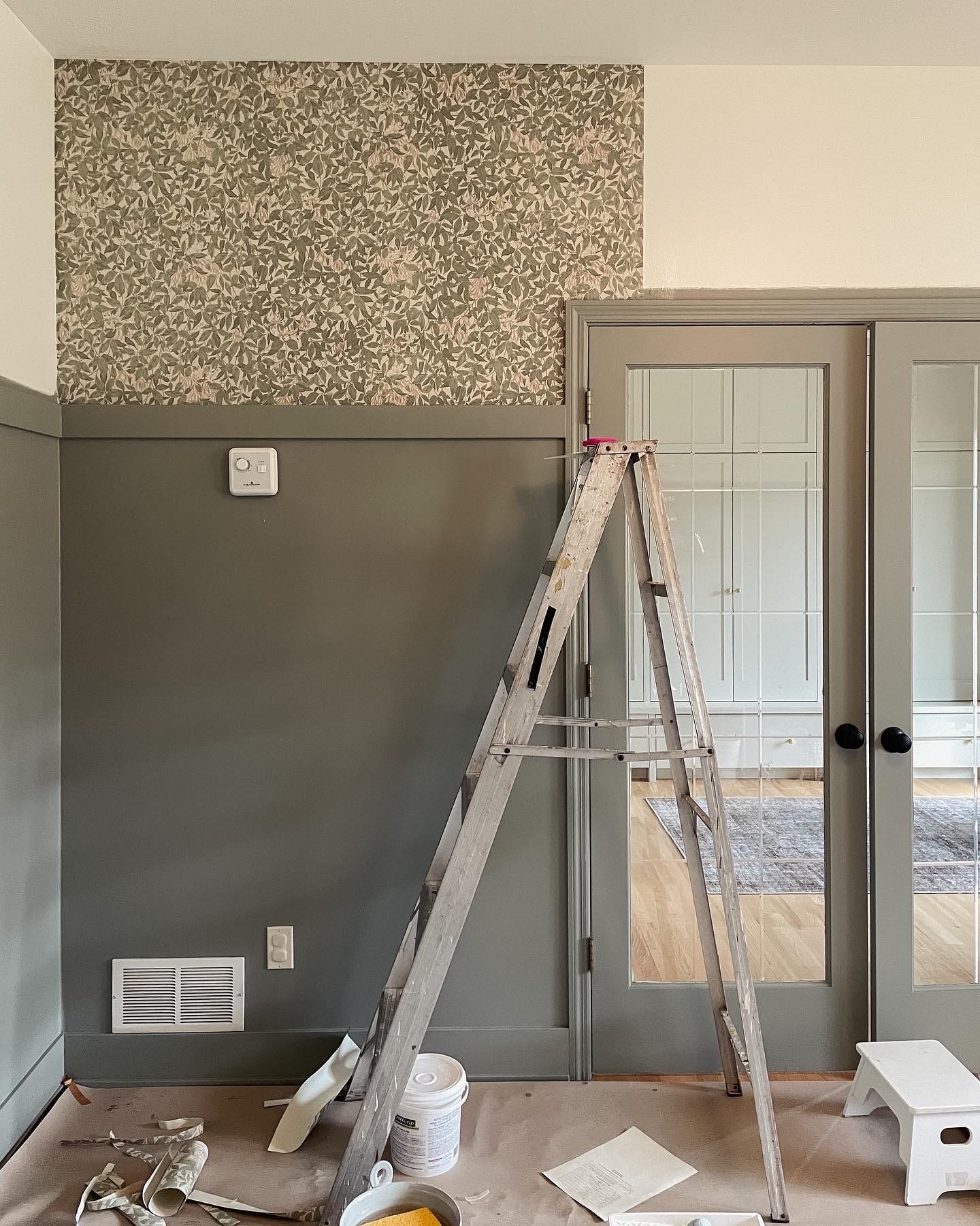
Sheen level can change the look of the paint color.
In my home I have the same neutral white in our large open concept living, dining, and kitchen space, but I changed the sheen level of the color. Ceiling is flat, walls are eggshell and trim is satin. I’m often asked what the colors are on my different surfaces, when in reality it’s all the same but the sheen level creates subtle differences. I’d suggest swatching (if you can) in the actual sheen level you’re planning on using. I know some paint shops will only sell samples in one sheen level, but just keep that in mind when observing your paint samples.
If you’re feeling overwhelmed still at the paint store, do this.
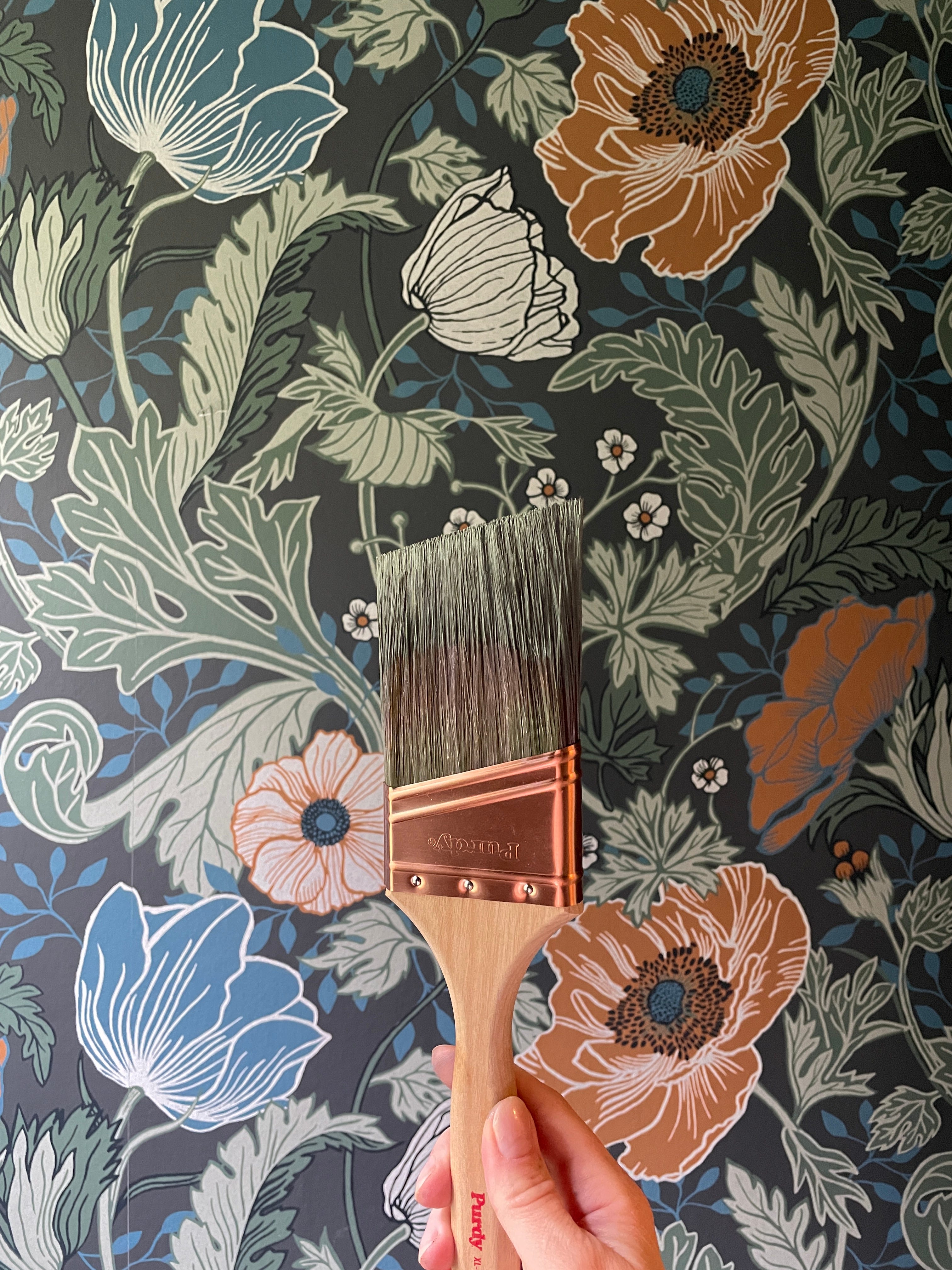
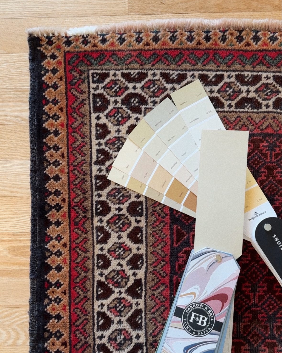
You’ve read the above tips and you head to the paint store all excited to pick the *right* color, but as soon as you start browsing you’re completely overwhelmed with options. Don’t panic. There are a lot of paint color options and I still often feel overwhelmed by them. When that happens I suggest looking to your rug, a key art pieces or favorite pattern in your design for guidance. If you picked a patterned rug, look at the colors in it and find paint swatches that closely resemble those colors. Back to the bedroom example, I know I want a soft, muted color on my walls, not a white, beige or gray, but not full on saturated color. I’m not sure if it should be green or blue or something else completely. Let’s say you found a secondhand traditional Persian vintage rug you love. The main color of the rug is a deep warm-toned red, but when you look closer you see a muted green, deep navy, and beigey yellow color woven into the design. Use those accent colors as your inspiration for the wall color. Find a muted straw color that feels like a cousin to the beigey yellow in the rug. You could also find an exact match to the an accent color, which is a mid-tone. You could then move up the swatch palette to a lighter color or down on the swatch palette to a more dark, saturated version. It might take a few trips to the paint store to grab more swatches, but the extra effort is totally worth it, then just painting the walls and hoping it works only to find out it definitely doesn’t work in that room and now you have to paint again!
My best overall advice is to take your time. When you rush to just get the room finished you often make the job of “finishing” the room harder because you now need to reverse engineer the furniture and textiles to work with the wall color.
I’d love to know if you want me to dive deeper into this or have a specific paint question! Leave it in the comments and I can work on another post to answer. Thanks so much for taking time to read my article and truly hope it helps you feel empowered to make design decisions in your home! Please subscribe for more interiors advice.
Warm Wishes,
Kitty
I love how the colors can shift the mood throughout the day! Love your advice on 24 observations to get a better feel of the paint colors!